Christine Haire
UI/UX Designer – Web & App
SKILLS AND TOOLS
About Me
I use human-centered design to get to the root of the problem and design a solution. I am passionate about sustainable projects and especially enjoy creating a seamless user experience. Looking to tackle tough problems and change the world.
Uckfield, East Sussex
English, Fluent
Links
Web Portal & Website UI / UX
case study | SARScore

Project Overview
The SARScore project involved designing a new website and administrative web portal for address ratings.
Focusing on a modernised brand image and a seamless user experience
Challenges And Objectives
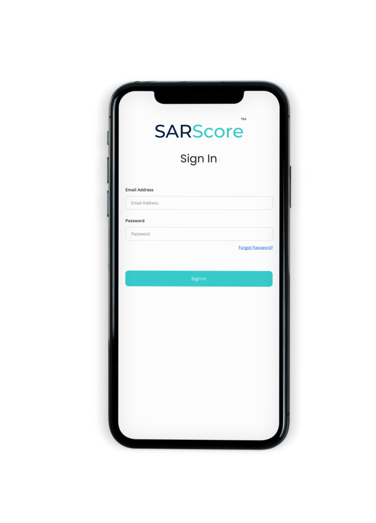
The design of SARScore’s web portal involved extensive research to ensure an optimal user experience (UX), particularly considering the usability for every day users. My approach was grounded in simplifying the user flow which required careful planning and execution.
Initial Research and User Analysis
I began with in-depth market research and user analysis to understand the specific needs and challenges faced by SARScore’s target audience.
Before I started any wireframes, I conducted online surveys with potential users, including professionals who would benefit from SARScore’s services. This helped me gather valuable insights into their daily challenges and expectations from such a platform
Translating Complexity into Simplicity
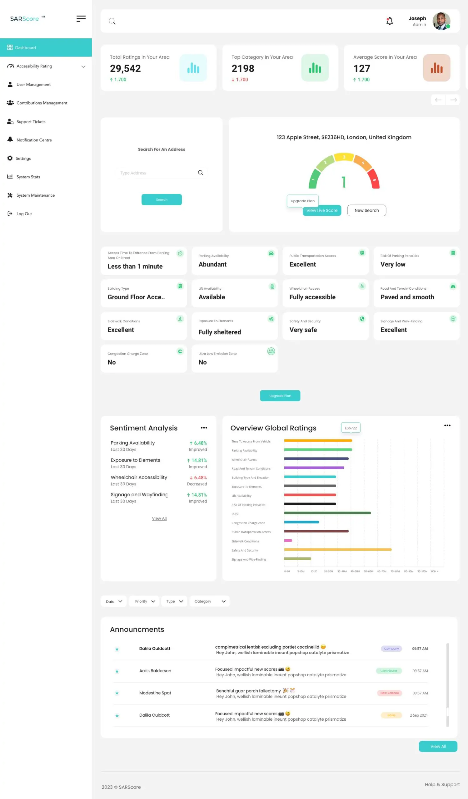
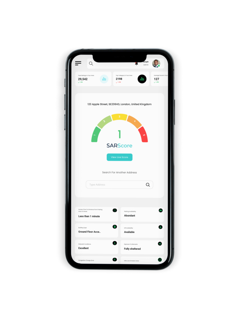
Given the complex nature of SARScore’s offerings, a key goal was to translate this complexity into a user-friendly interface. I focused on creating a clean, intuitive layout that would not overwhelm users.
I worked on streamlining the information architecture, ensuring that users could navigate the portal effortlessly and access the necessary features without confusion.
Developing a User-Centric Design
Every aspect of the web portal’s design was approached with the user in mind. I employed minimalist design principles to keep the interface clean and free of unnecessary elements that could distract or confuse users.
The use of clear, concise language and visual cues helps to guide users through the portal, making the process of accessing and interpreting complex data as straightforward as possible.
Iterative Testing and Refinement
The UX design process was iterative, involving multiple rounds of testing and feedback. I utilised both usability testing and A/B testing to refine the interface, layout, and navigation.
This iterative approach was crucial in ensuring that the final design was not only aesthetically pleasing but also highly functional and user-friendly.

User Personas
I developed several user personas to represent the primary users of the website. This included personas like ‘New Users’, who are unfamiliar with the platform and looking for information; ‘Standard Users’, who need simple access to contribute and view a simplified version of the platform; and ‘Corporate/Premium Users’, who interacts with the portal, manages scores, dives into the data analytics to help their overall business needs. These personas helped in understanding the different needs and behaviours of each user type.
User Journey Maps
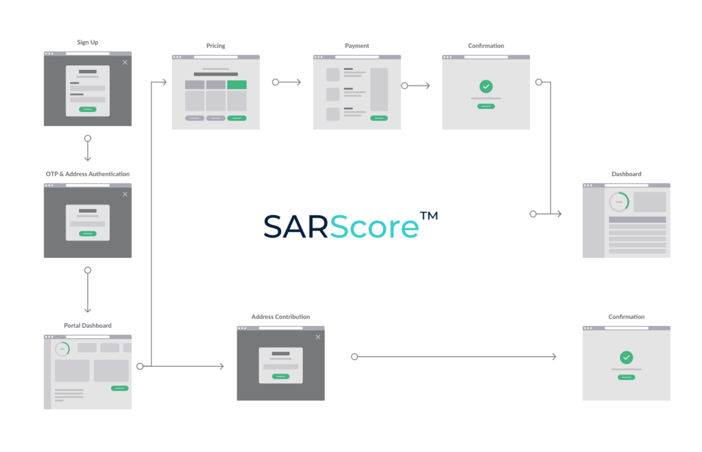
I created detailed user journey maps for each persona. These maps traced the steps taken by users from the point of first visiting the website and portal to searching for particular addresses, contributing, and viewing in-dept data. This exercise helped in identifying key touchpoints where the user’s experience could be enhanced and the process streamlined.
Sketches
Started the wireframe process with rough sketches. These initial sketches focused on the overall layout, navigation structure, and the placement of key elements like the onboarding, homepage portal, and contributions. This entailed 4 different sketches as there are 4 different portals based on the tier, standard users, premium users and corporate users along with the administrator login too.
High-Fidelity Prototypes
Developed prototypes in Adobe XD. These prototypes were crucial in simulating the actual user experience. They included interactive elements such as clickable menus, tier selection processes, and access to metric and data materials within the admin portal.


Additional Works
Website:
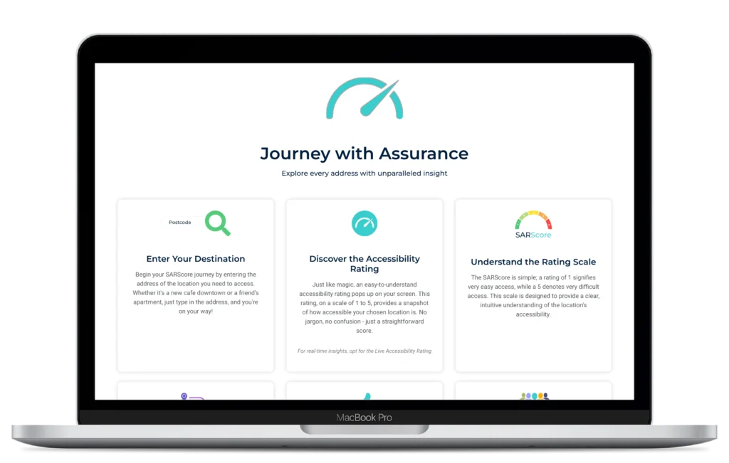
Along with the portal, we created a website for SARScore. I have done a separate case study on this here.
Explainer Animation Video:
I organised an explainer animation videos, seen below, for SPT. This entailed crafting a clear story board, organising the voice over artist along with the help of creating custom graphics.
Branding & Logo Creation
Everything from the fonts, colours logo and overall look and feel I have created from scratch, collaborating with the stakeholders of SARScore.
The thought process for the logo can be seen below.
My Thoughts
I had a wonderful experience working on this project, which began as a concept shared by the stakeholders. They gave me a blank canvas, offering complete creative freedom.
To develop a coherent structure and thought process for this web portal, I needed a deep understanding of the functionality of each section and how they interact. The portal comprises over 60 screens, each requiring meticulous planning and thoughtful organization.
The project pushed me to refine my strategic thinking and attention to detail, aspects I found particularly thrilling. From the initial discussion with the client to research, wireframing, prototyping, branding, design, and both front and back end development, including testing, the entire process spanned 6 months.
Reflecting on this journey, the satisfaction of transforming a vision into a tangible, functional portal was immensely rewarding. It not only tested my abilities but also expanded my skill set, culminating in a product that we are all proud of. This experience has left me eagerly anticipating the next challenge, ready to apply the insights and knowledge gained from this comprehensive project.
