Christine Haire
UI/UX Designer – Web & App
SKILLS AND TOOLS
About Me
I use human-centered design to get to the root of the problem and design a solution. I am passionate about sustainable projects and especially enjoy creating a seamless user experience. Looking to tackle tough problems and change the world.
Uckfield, East Sussex
English, Fluent
Links
Event Management Sector Website
case study | Secure Port Technology

Project Overview
As a startup, Secure Port Technology faced the unique challenge of presenting its innovative, yet currently hypothetical, security solutions across various sectors.
The website must captivate potential clients and stakeholders by conveying complex services and the envisioned impact in an engaging and understandable way.
My Approach
Understanding the Unique Challenge
Recognising that Secure Port Technology was at a conceptual stage, with services yet to be implemented in real-world scenarios, I understood the importance of conveying the value and potential impact of these services in an engaging, visually appealing way.
The limited textual content presented an opportunity to think outside the box and use visual storytelling to capture the audience’s imagination.

UX Design Process
User Research
I started by defining the target audience for SPT, which included professionals across various sectors in need of innovative ticketing and security solutions mostly in the event management sector.
Through various surveys and hypothetical user personas, I gathered insights on the users’ needs, such as the desire for clear, engaging information about SPT’s offerings and straightforward navigation.
Strategy and Content Structure
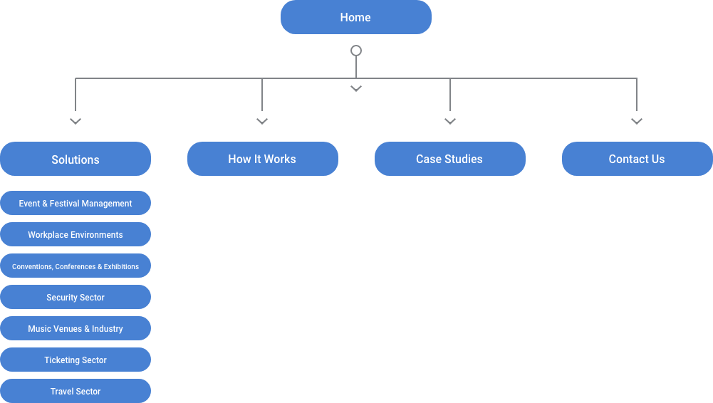
Based on the research findings, I developed an information architecture that organised the website content logically, ensuring easy navigation and accessibility.
Given the limited text, I decided that the content strategy would heavily rely on visual storytelling through motion graphics to explain and showcase the services SPT intended to offer.
Wireframing
I sketched low-fidelity wireframes for each webpage, focusing on layout and the placement of key elements such as the navigation menu, sector-specific information, and contact forms. This stage allowed me to map out the user journey without getting bogged down by design details.

Adapting UX Design for Conceptual Content:
Embracing Motion Graphics
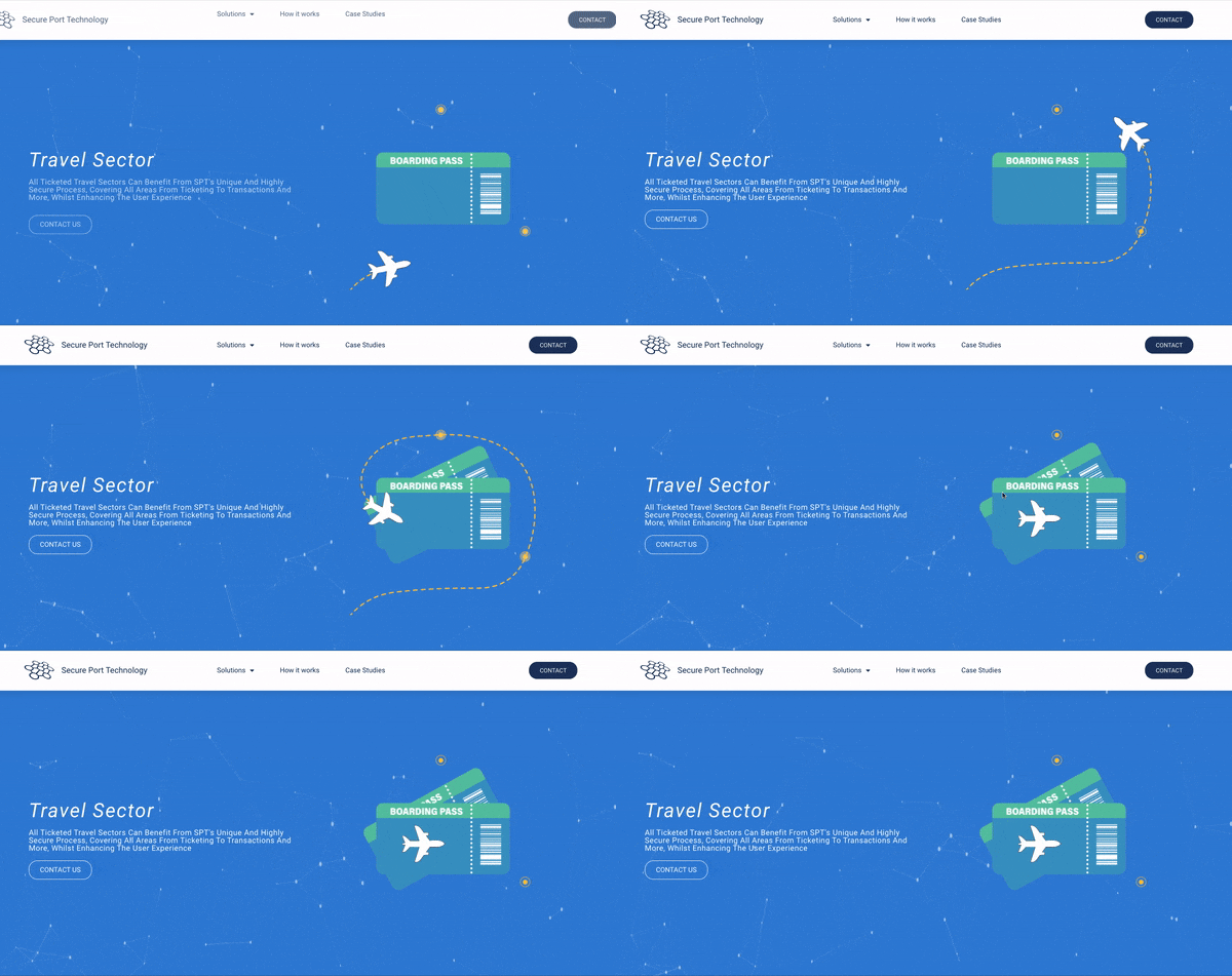
I incorporated dynamic motion graphics throughout the website. These not only illustrated SPT’s services but also brought hypothetical scenarios to life, showcasing how these solutions could be applied.
By visualising the processes and benefits, I made abstract concepts tangible and engaging, ensuring visitors could grasp the potential without wading through dense text.
Sector-Specific Animations
For each sector, I added animations that detailed potential challenges and illustrated how SPT’s hypothetical solutions could address them.
This not only made the content more engaging but also helped potential clients visualise the startup’s value proposition for their specific needs.
Interactive 'How It Works' Section
I transformed the ‘How It Works’ section into an interactive, animated guide. This section broke down the engagement process with SPT using visuals and easy-to-understand language to appeal to a broad audience.

Conclusion and Reflection
By integrating motion graphics and interactive elements into SPT’s website, I tailored the UX design to highlight the startup’s conceptual stage and future potential.
This strategy not only overcame the challenge of limited textual content but also set a foundation for a visually rich, engaging user experience. As SecurePort.Tech evolves, these UX elements will remain vital for illustrating the company’s transition from concept to reality, ensuring the website continues to be an effective engagement tool for attracting stakeholders.